XAML Controls Gallery
Design lead, visual design, sprint reviews.
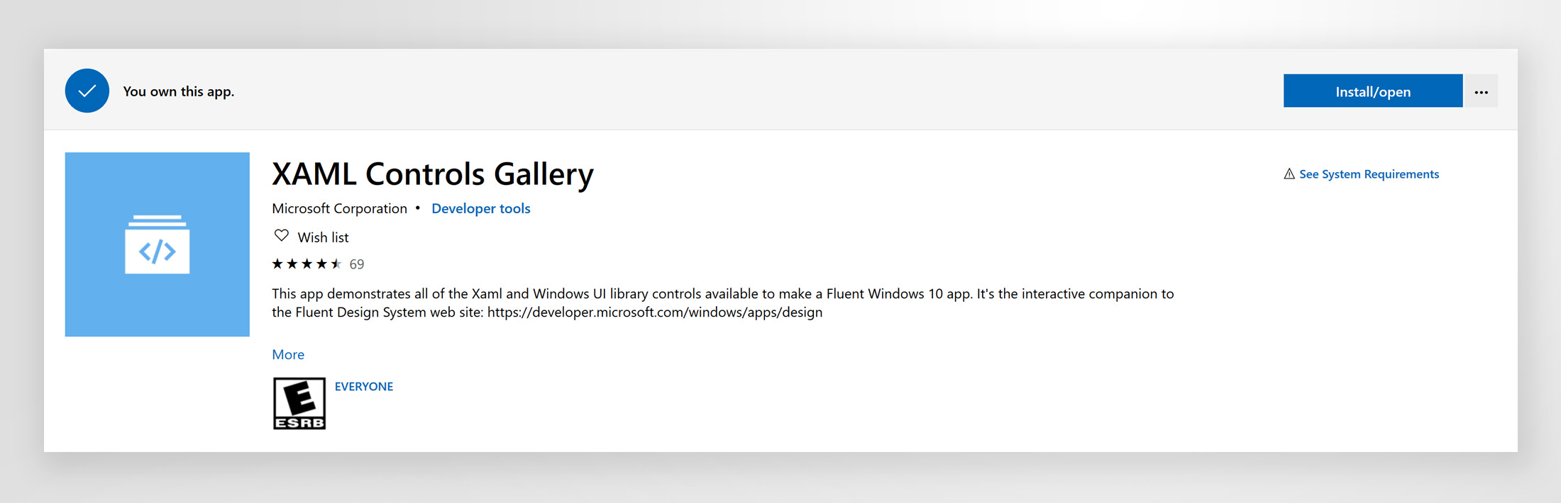
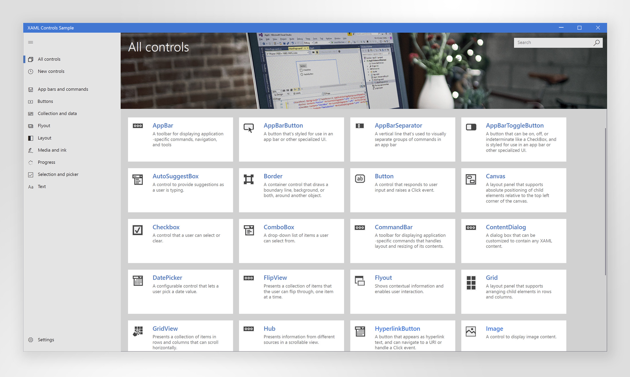
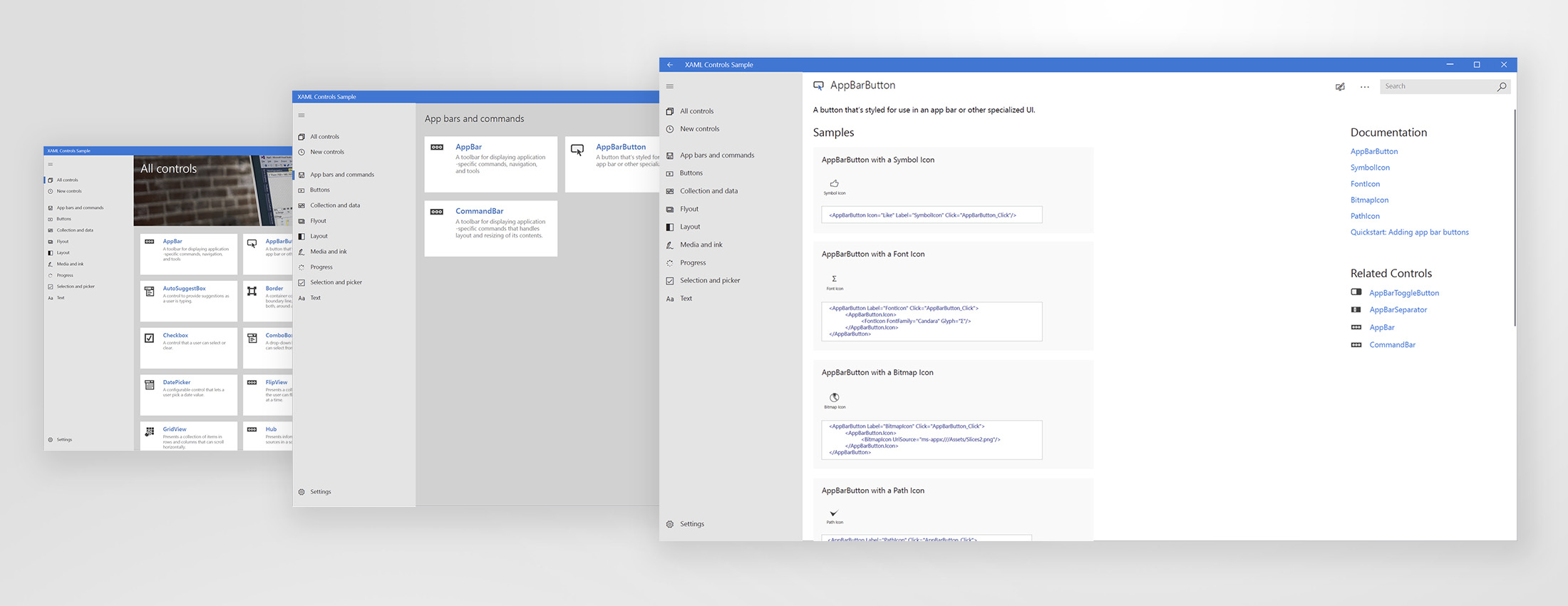
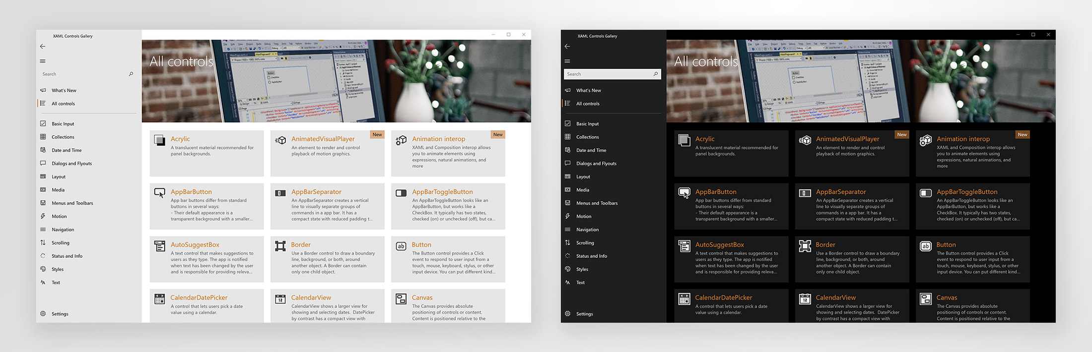
App that demonstrates all of the XAML and Windows UI library controls available to make a Fluent Windows 10 app. It’s the interactive companion to the Fluent Design System web site. It was featured at the Microsoft Build conference in May 2017 and released on the Microsoft Store immediately. It currently has a 4.4/5 rating.
The challenge
Windows had an instructional app for Windows 8.1 where they showed some explanation and samples for basic Windows UI controls. The client wanted to refresh the application to introduce the new Microsoft Fluent design system. App would include markup and code of Windows controls as well as the new Fluent controls. The project did span less than 2 months, most of it spent on code reviews.
Goals
The project strived to provide an update to the existing application following the soon-to-be released (at the time) Microsoft Fluent design, improve accessibility (keyboard and narration control, color contrast, etc.), ensure Xbox support, and provide a scalable solution for future inclusion of new controls. App itself needed to use the interactions and materials being introduced with the new design system, such as Acrylic (translucent blurred background) and Natural motion interactions.
Approach
Project dynamics
One of the first things I did when the project kicked off was to get familiarized with the Fluent design. I worked closely with the PM, technical lead, and client to understand the extent of redesign the application was undertaking, and to understand the needs for each of the main sections of the application. Once the design kicked, I onboarded another designer to help explore some treatments mentioned in the next section. After the design was approved, I worked closely with the tech lead and developers to ensure all details were following the Fluent system and to deliver the assets.
Application design
In general, the layout of the application was a bit limited by the new Fluent controls, however, I had some freedom to decide several elements, and for those, created several variations in order to see what worked best, and to get client feedback. Explored options for landing page content (banner/no banner on top, background colors for tiles, and more). For the icons used on each control, I played around with several styles but we ended up using the ones from Visual Studio as to give the users more familiarity with the content. Some of the earlier explorations carried the Search bar below the image banner and above the controls list; it was eventually moved to the top right, on top of the banner; the latest Fluent style suggests to put search in the navigation, on the left panel, and that’s where it lives in the current live app.
The application lets user change between a light or dark theme, which helps showcase the different controls in variable styles.
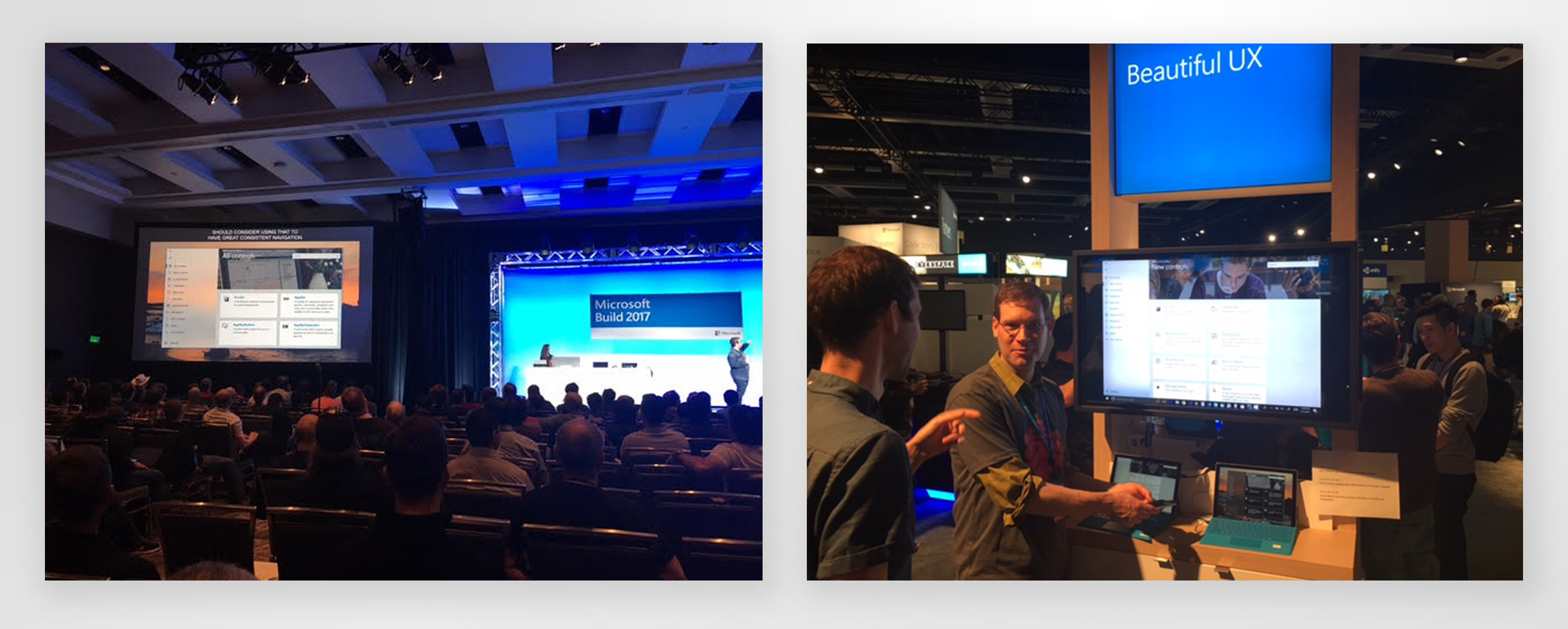
Microsoft BUILD 2017
The application was unveiled during the Microsoft Build conference in May 2017, with a positive reaction from the crowd during the session, as well as in the demo booth. You can watch one of the sessions here (around the 48:55 mark).
Microsoft Store
The application is available and can be downloaded from the Microsoft Store to multiple devices including PC, mobile devices, and Xbox One.