
Microsoft Store - Store Portal
Design lead, research, requirements gathering, wireframes, visual design, style guide, sprint reviews.
The project consisted in redesigning the internal communication portal used by store employees, management, and corporate teams to engage on a daily basis. This one-stop place allows associates to see daily price changes, latest promotions, store layouts, trainings, reports, and any critical information to do their job. The effort took almost 2 years with multiple design iterations. The main effort was spent revising the taxonomy of the site through analysis of data and insights… and lots of meetings.
I partnered with content strategists, program managers, and store associates to construct this experience that would enable them to be more productive . We launched the new site around mid 2014 and some of the highlights were the inclusion of social features, giving useful content prime real estate, and a revised sitemap for an intuitive navigation.
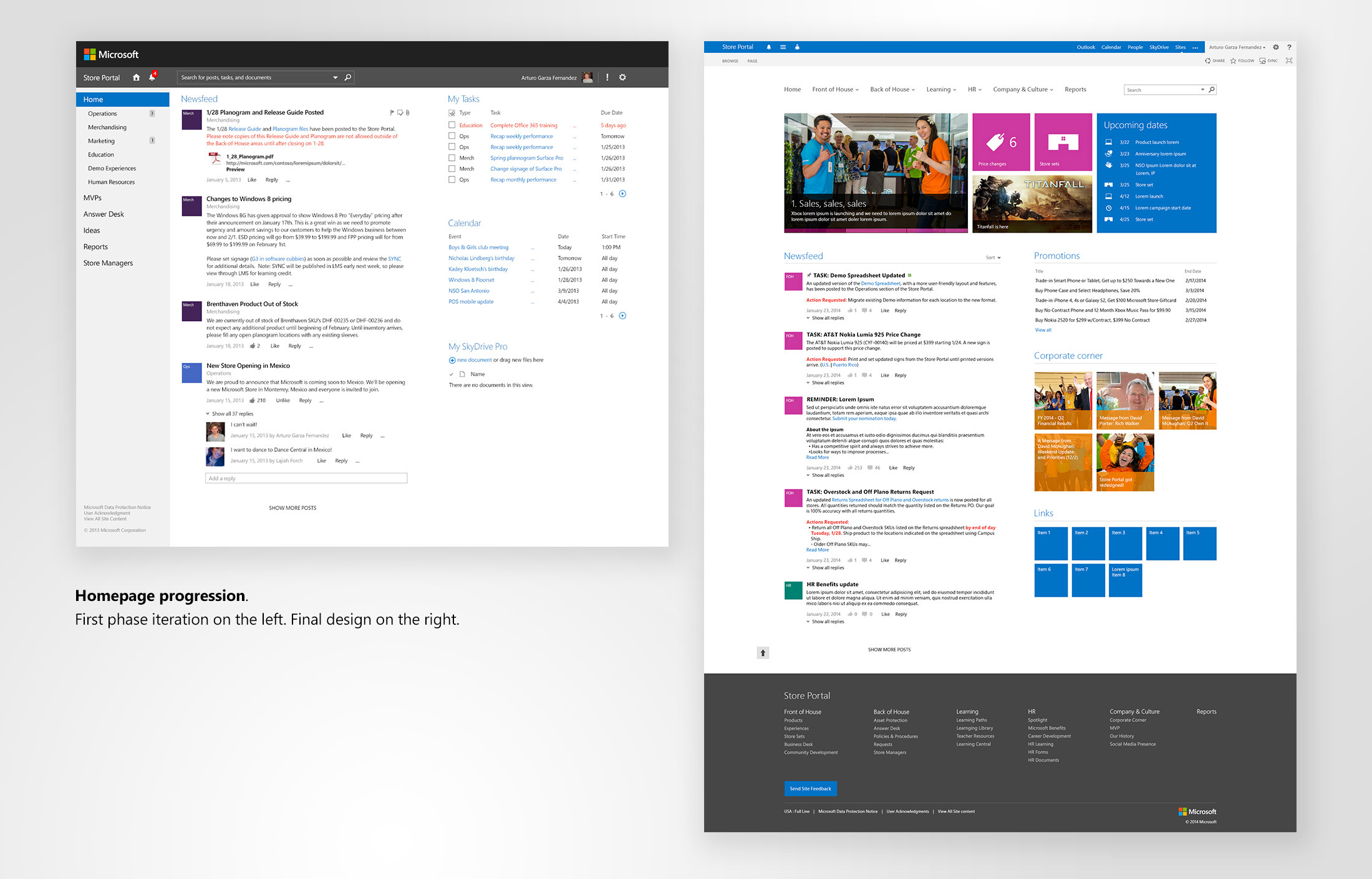
The challenges
At the time I worked on the project, around 4,000 store associates worked across multiple stores. The portal they used was not optimized for their experience; for example, the homepage included an outdated video, latest 5 promotions, and a list of all the stores. While seeing a list of promotions was useful, the other pieces were not; especially for occupying the front real estate. The taxonomy of the site was also an issue, as the information was scattered and presented without clear organization. As a result, search wasn’t very useful, it rarely returned accurate results, and for a content heavy site, this is crucial. These and other struggles made it hard for associates to be able to consume content in a pleasant manner. In parallel, and perhaps as a result of the issues aforementioned, a lot of the interactions occurred via emails, causing overhead and information repetition. This large-audience content portal was in dire need of a revamp.
- Store associate
Goals
These were the main goals, and remained consistent throughout both phases of the project:
- Fix search (I don’t get results, or what I get doesn’t make sense)
- Make content shine (front and center and make this a one-stop place)
- Revise taxonomy and navigation (Make it intuitive and targeted from store associates point of view, not corporate divisions)
- Make it look current (update look and feel and align it with Microsoft brand guidelines).
- Design with social in mind (be able to like and comment posts, notifications for interactions, task management, reduce email communications).
- Optimized for touch (primary device of usage was going to be Microsoft Surface devices).
Phase 1
Research
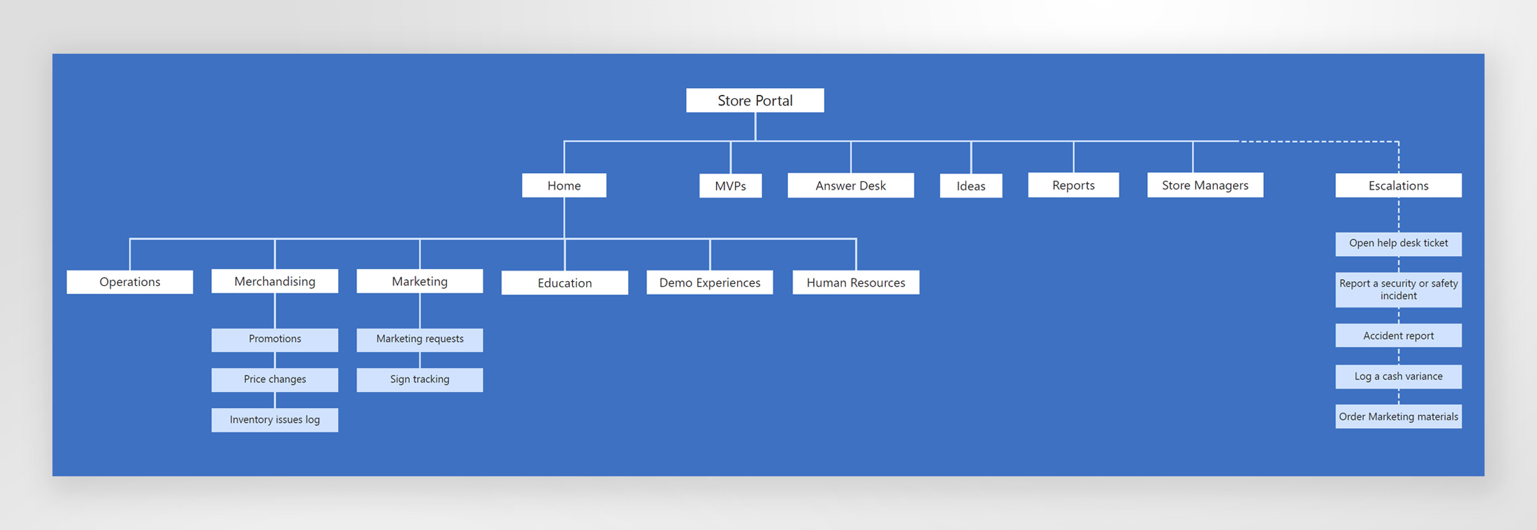
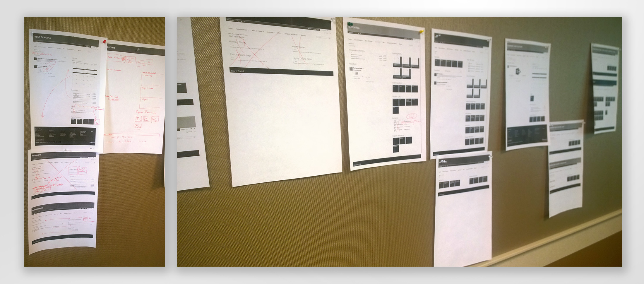
The core project team was lead by an expert intranet PM and included other project managers, a dev lead, and myself. One of the first steps was to do an audit of the current site to understand how information was categorized. In parallel, we talked extensively with teams from all the different areas (Operations, HR, Merchandising, Marketing, Experiences, Education, etc.) and started to put together some structure to the new site and to identify different user types and permission levels (store associates, store managers, assistant store managers, admin, content teams, store corporate employees). With the information we had, we started to build the sitemap.
Visual design
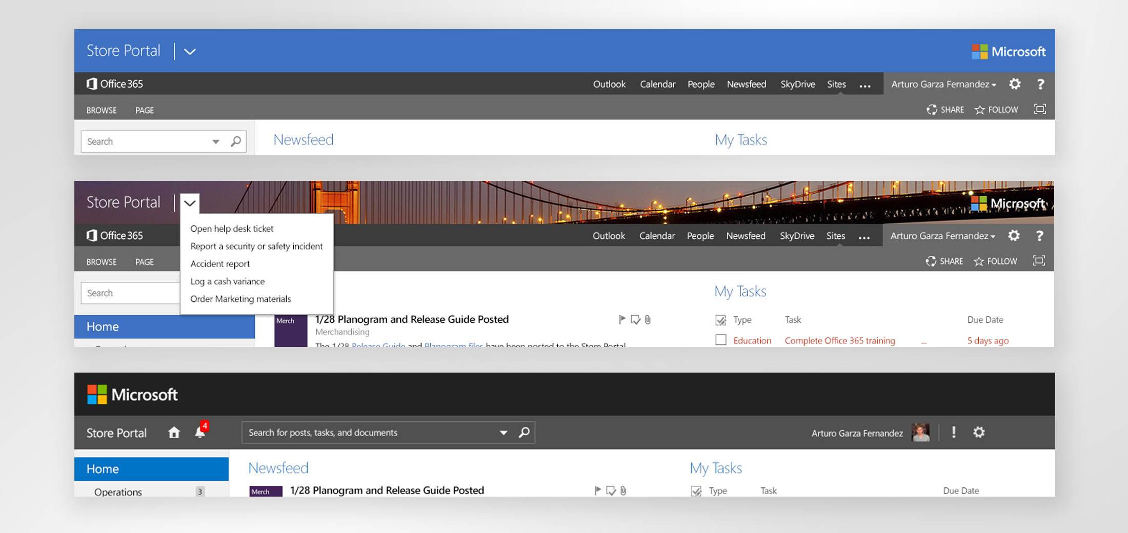
The portal was going to remain being a SharePoint site, so we were a little bit limited at first with some design decisions. Early on we decided to use a left side navigation, and keep the top nav bars simple. I had some explorations where the background would change, depending on the store to which the associate was associated with. The third one shows the final design we had for the first phase.
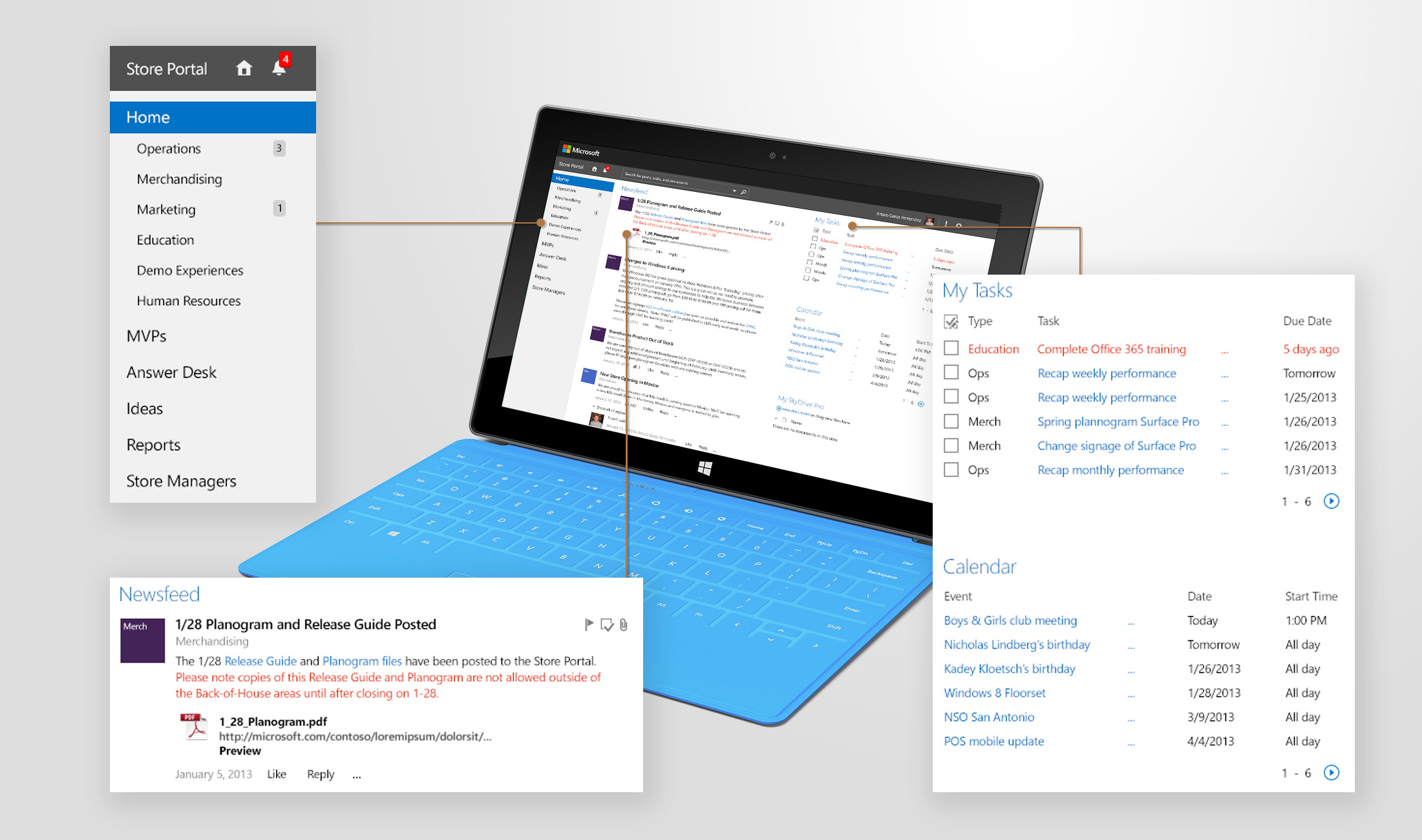
Phase 1 homepage design is shown next. It’s a place to share ideas, raise questions, perform daily tasks, collaborate, get inspired.
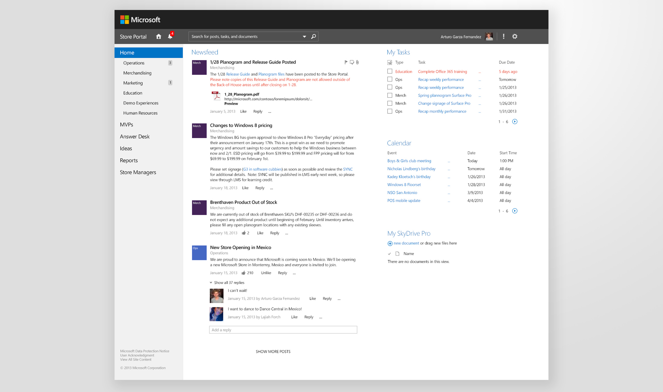
Key areas from the home. The navigation was clear and structured by content type. The newsfeed allowed different channels from the corp team to share any updates, for store associates to be informed, and in general to increase interactivity. One of the main benefits of introducing the social features was reducing a lot of back and forth communication that previously happened via email; now if someone from the store in San Diego had the same question as someone from Seattle or San Antonio, the corp team would need to reply just once in the newsfeed instead of having to reply to different 3 emails. The task management and calendar for store events were some of the most requested features.
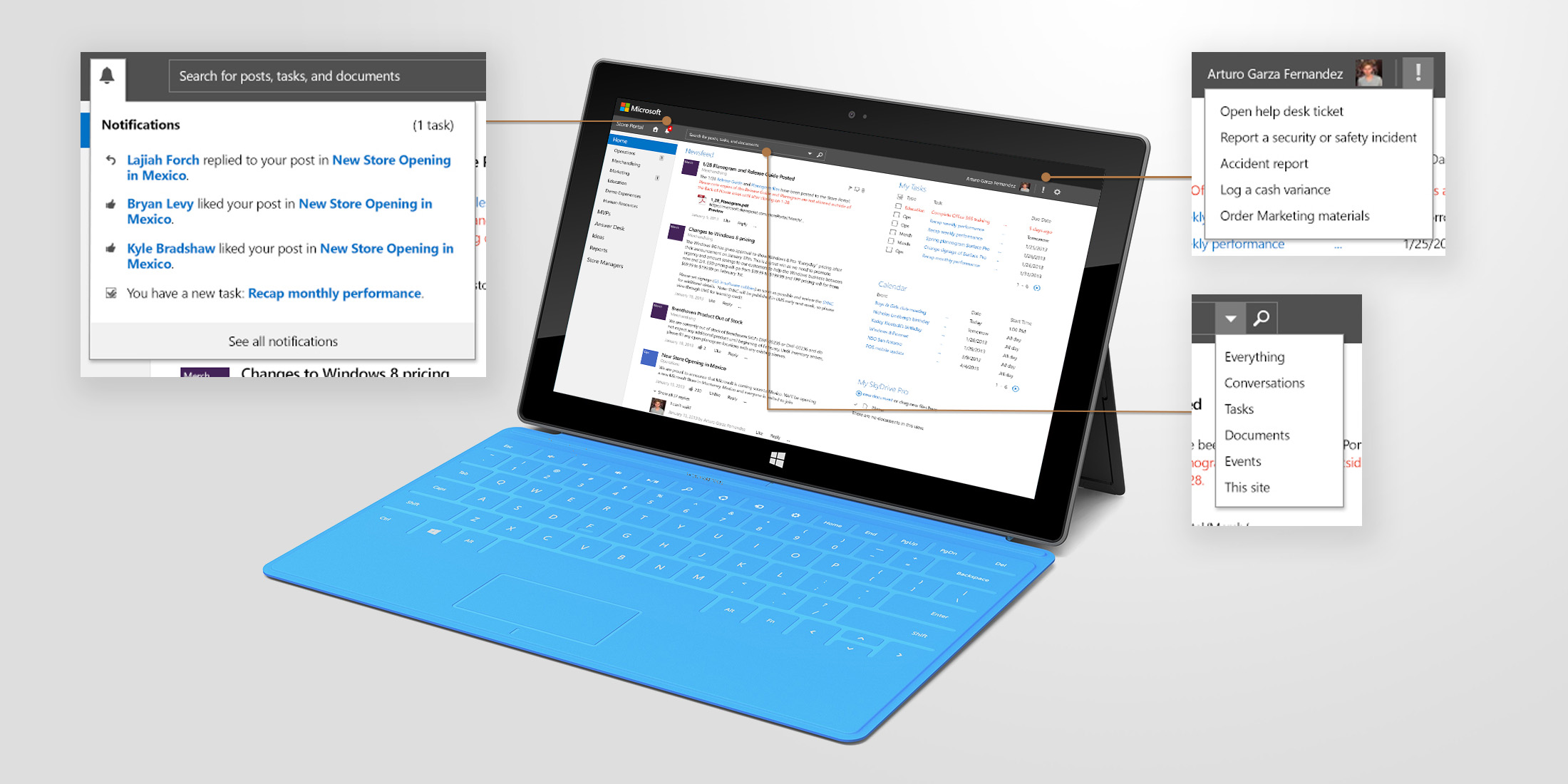
Notifications would help associates never miss updates, the search bar included options to scope the search space, and we added a quick actions element in the top nav bar for high priority store actions like opening a help ticket, reporting a security incident, or ordering marketing materials.
Phase 2
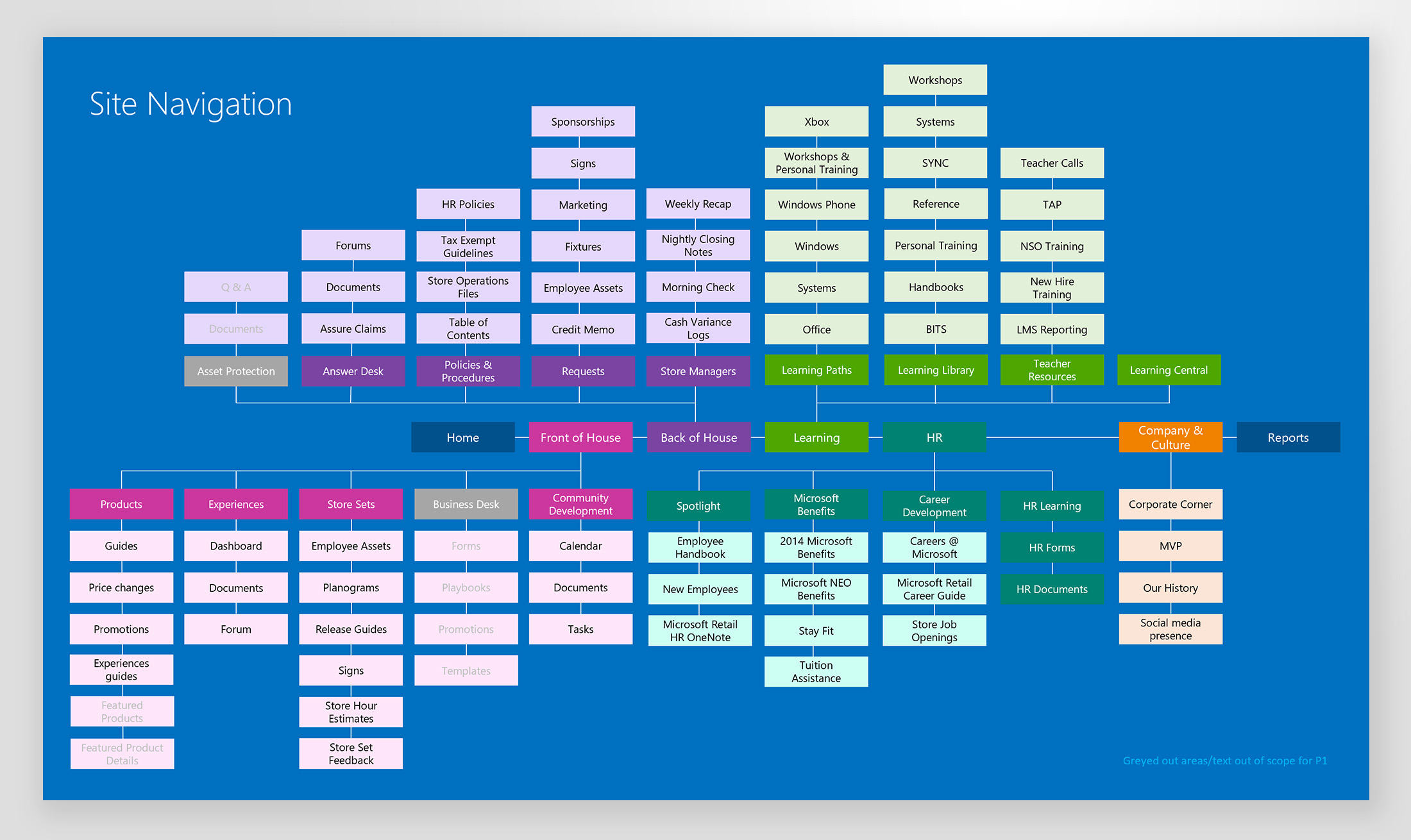
After a couple of months and socializing of the first approach, it was decided to expand and revise the taxonomy of the portal and this also presented an opportunity to re-evaluate the first design. We took the previous sitemap and tailored it even further from the point of view of how a store operates, which made more sense to the store associates than to organize it how the corporate team was structured.
Wireframes
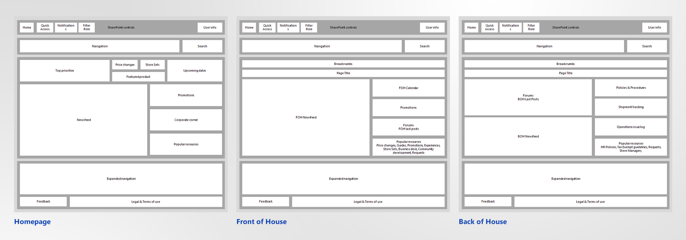
One of the main changes was the navigation, which we now decided to put on the top. I also moved around the layout, adding more components to the homepage and side columns on the template wires.
Visual design
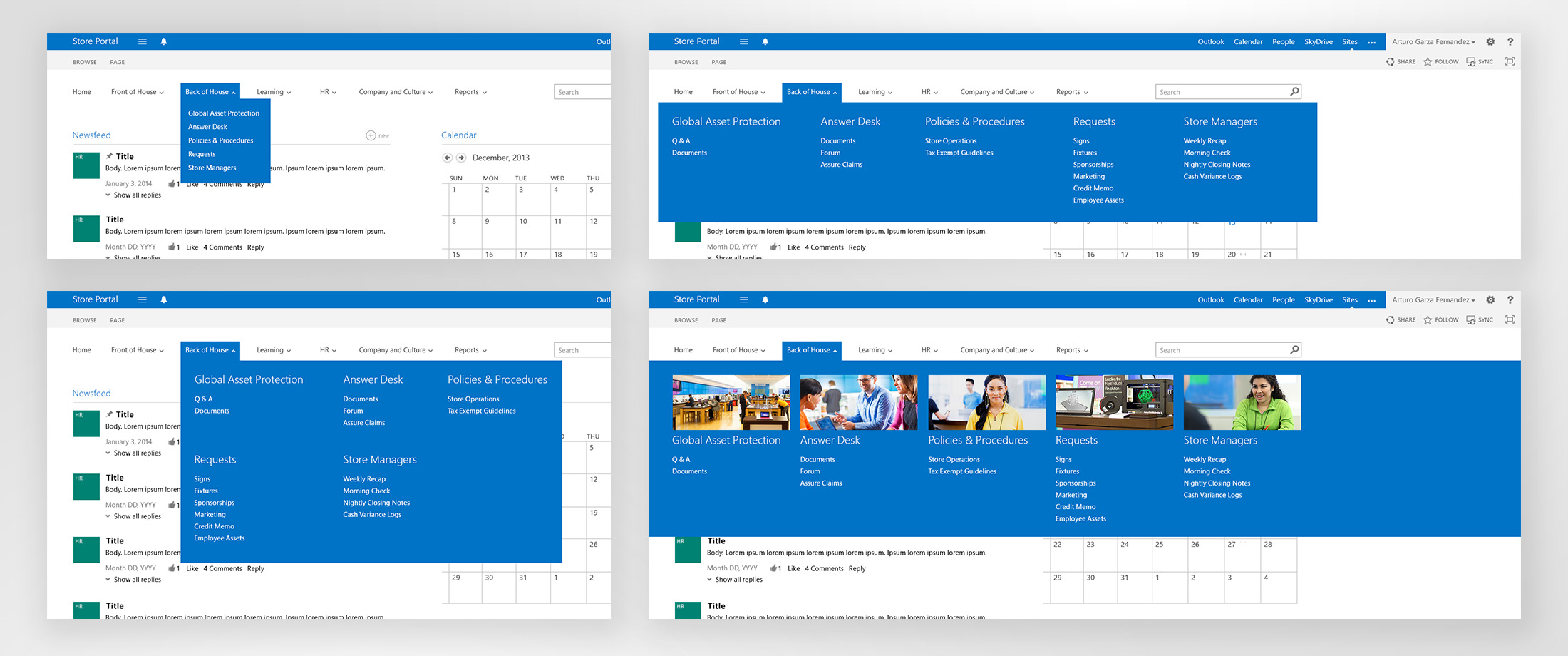
I explored multiple treatments for several controls. Next you can see some variations for the nav bar including some full width and parent/children options. We ended up going with the 3 columns approach.
Another revision I later proposed was the inclusion of the top dynamic header that would display the most relevant information for associates to see at a glance. Elements such as week’s priorities in a rotating touch-friendly banner, featured products, price changes, quick access to the Store sets page, and a list of important upcoming dates (which replaced the calendar widget).
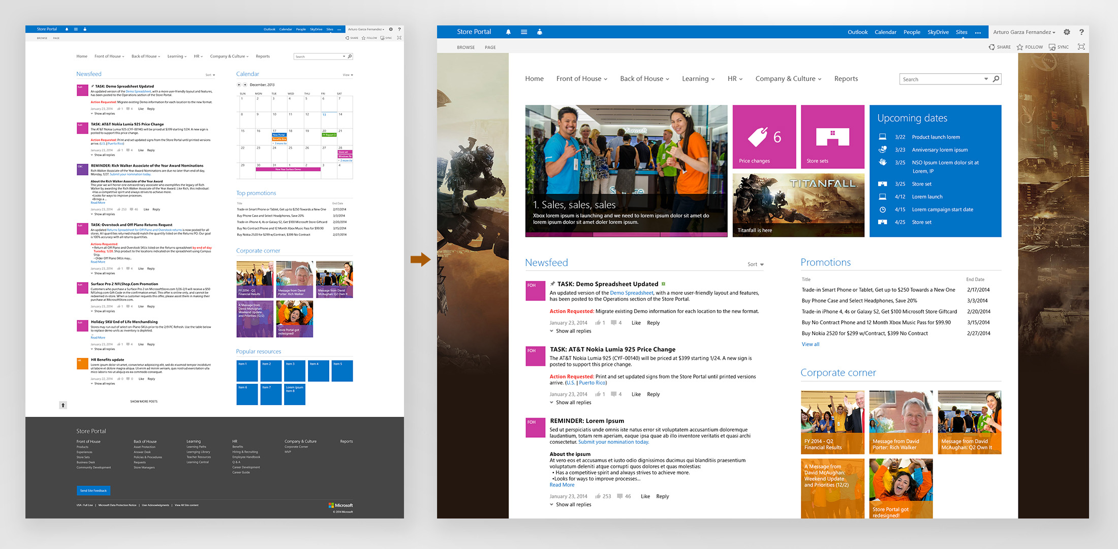
Top navigation bar also got an updated design to match the new portal style. We included in the comps an option to filter the page content by role and also to favorite elements such as pages or forms. In hindsight, I would change the icon I used back then for the quick actions to something that would represent better those 3 items.

We had a lot of meetings with several stakeholders and users to further tailor the site to be as useful as possible.
Final design
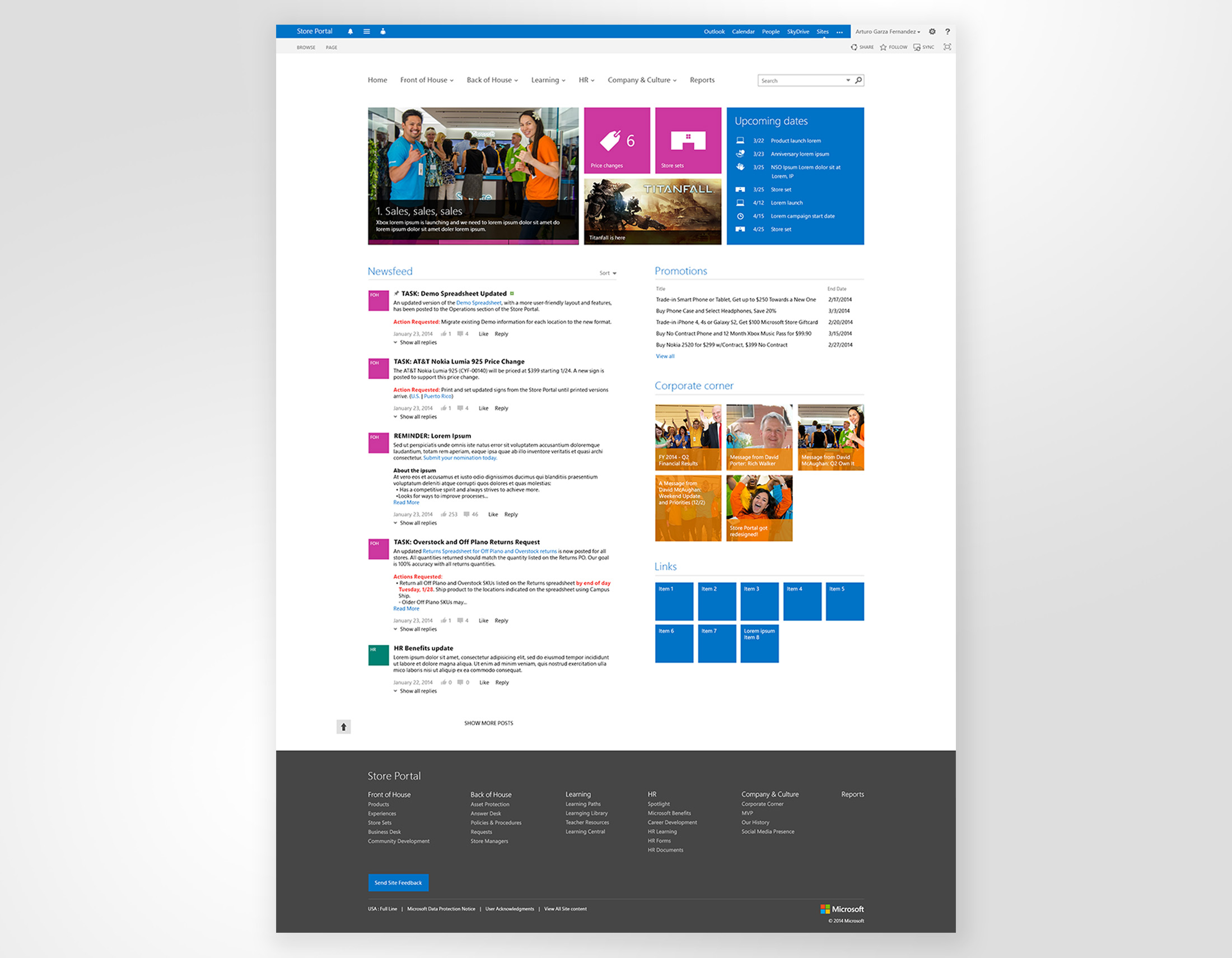
After a several months of explorations and conversations, we had a final design. It was aligned with the latest Microsoft design philosophy, met the business goals, and satisfied a lot of the user paint points. Elevating the content that matters most and providing a better navigation allowed to create a productivity website were the store associates had a single source for all needed updates to execute their daily job.
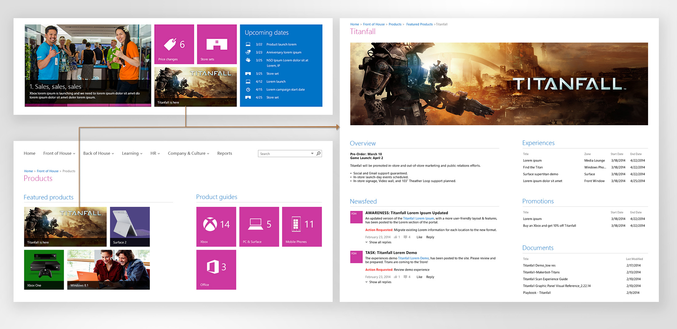
Next you can see a product detail page, which could be access from the hero dynamic banner, the Front of House page, and other areas. This proved to be a very successful way to capture all the information related to product launches including promotions, documentation, experiences in the store, and more.
Redlines and style guide
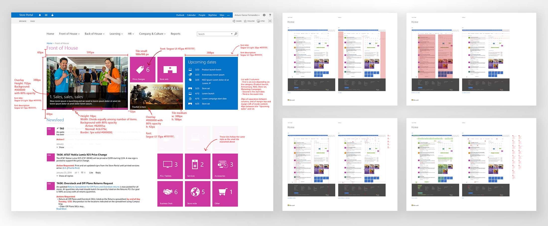
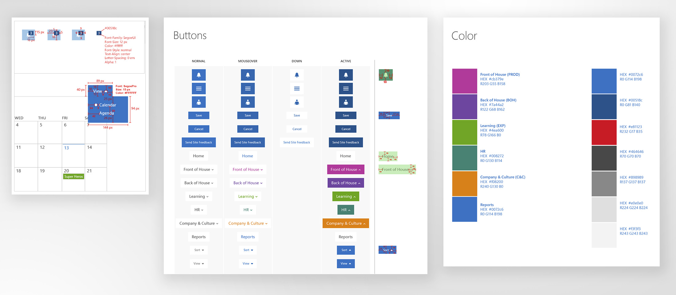
For the redlines part, I managed a designer on the team to help create this documentation. The document included spacing, alignment guides, touch target areas, font treatment, and more. The guide also specified the colors used for each of the content areas.
Development
During the development of the site, I worked closely with the dev leads and conducted design audits to create bugs so that we could provide the users with a great experience.

Learnings
The project extended over a long period of time but we created delightful connections that improved the productivity for our users. Store associates were beyond happy to get the new experience, and they had plenty of reasons for it. It paid off to go through all the design iterations and roundtable discussions, as we provided them with a comprehensive, simple tool, tailored to facilitate their day-to-day job. The new changes allowed us to reduce, in average, from 8 to 3 clicks to find content, and fundamentally increase collaboration across stores.