Microsoft Store Point of Sale
Design lead, research, IA, wireframes, prototyping, visual design for slate version. Code reviews, design updates, and user testing for phone version.
The Point of Sale (POS) system is an essential pillar of a retail store and I worked on the redesign of this tool for the Microsoft Store in multiple stages of the project. A few years ago, the system used to run on a slate device, and through research and technology upgrades we brought it to a mobile experience. I worked on this project from July to December of 2011 for the slate version, and July 2012 to February 2013 for the release of the mobile experience.
The challenge
When I first joined the project, the system had a very low satisfaction rate among store associates. The navigation was difficult to understand, even for seasoned users; there were multiple different sets of navigation patterns, all coming from a different side of the screen. The terminology used was not descriptive enough for the call to action buttons; some elements were presented multiple times in different menus, some screens didn’t have a way to go back. Ultimately the experience needed an upgrade to facilitate the store associates job of ringing sales, finding product details, and looking up customer information, appointments, and transactions.
- Store associate
Goals
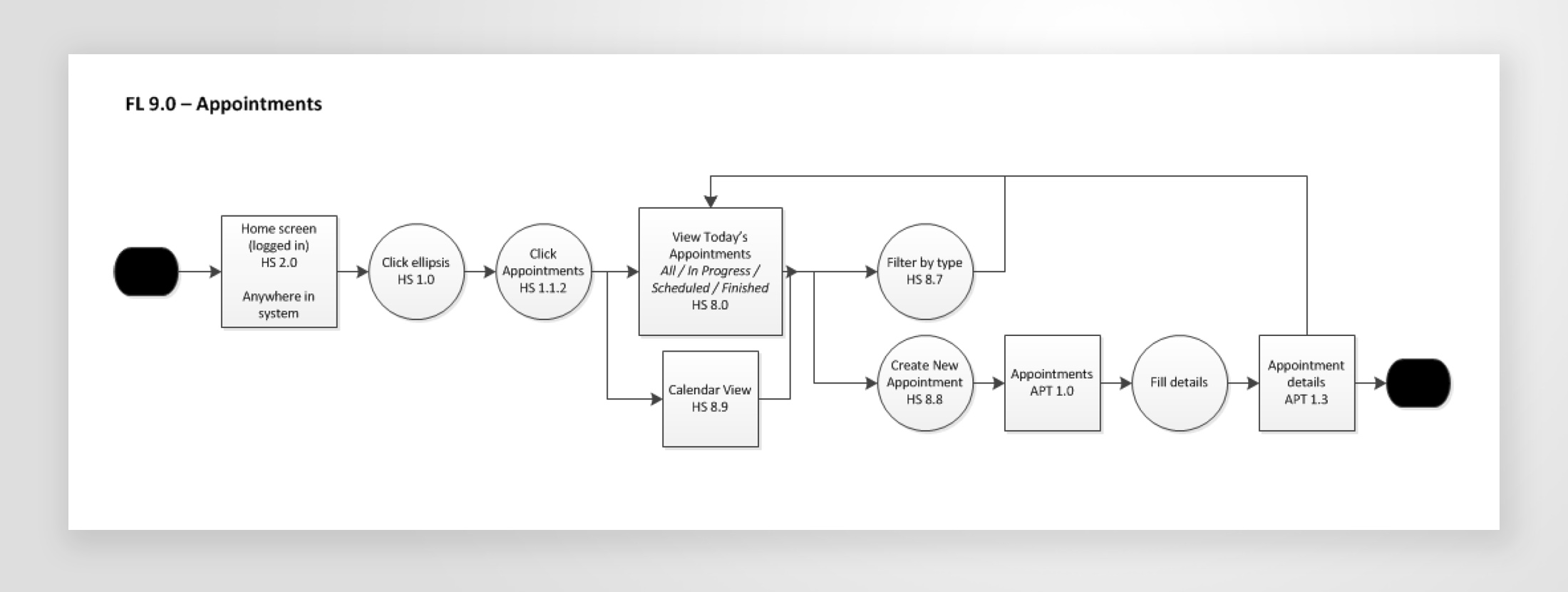
One of the main goals was to revise the navigation, taxonomy, and nomenclature of the tool (clear paths of action for the use cases). We wanted to streamline the workflows (facilitate sale experiences and reduce training time). Reduce transaction times (be able to do a basic check-out process in less than 2 minutes). Expand functionality and content in the Appointments section (bring valuable information forward, such as history and management of appointments). Revamp the visual style (match with the latest Microsoft branding). Last but not least, migrate the slate experience into a mobile phone one.
Slate POS design
Users
At the time of this redesign, there were 117 stores opened across the US and Canada, with approximately 4,000 store associates working there. We identified several personas and user types including store associates (product advisor, technical advisor, answer desk), management users (store manager, assistant manager), store clients (very few direct touchpoints with system), and other indirect users from the corporate team (operations, marketing, merchandising, and more).
Design Research
In order to redesign it into an intuitive, user friendly, and efficient experience, I partnered with the operations team and some PMs to conduct a series of research studies with store associates to understand their workflows, pain points, priorities in the sales experience, and expectations. It was mostly interviews and observation of employees in the stores, which proved to be a fructuous effort in order to understand the retail world and the current POS. At that time, there was another designer on the team working on some visual treatments for the home and it was good to bounce some ideas in whiteboard sessions.
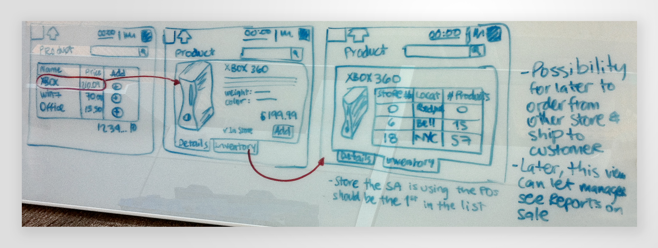
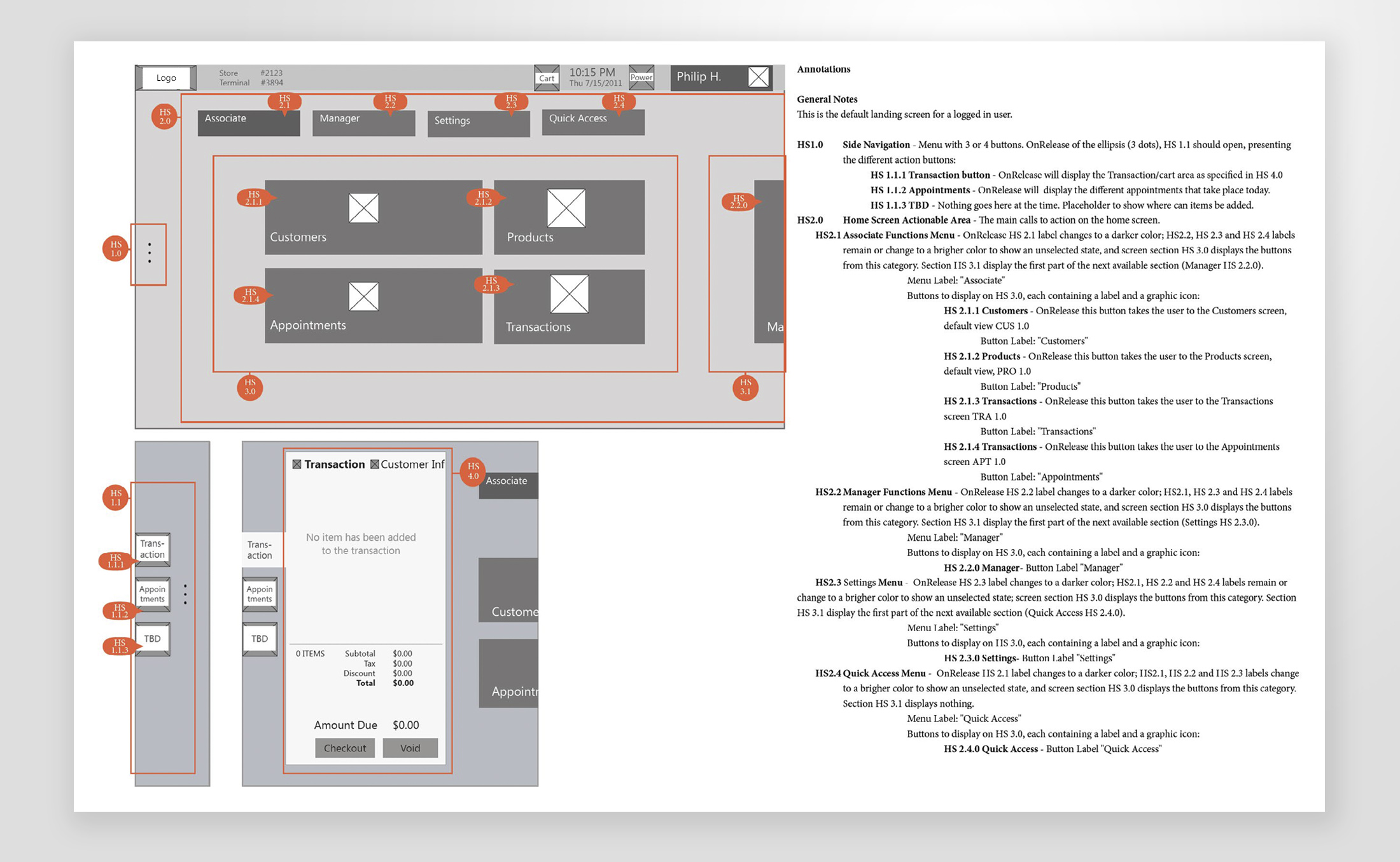
With the information gathered thus far, I started to work on an IA document, capturing the different personas, flows, and screens needed. The document included detailed wireframes with annotations explaining the purpose of the elements on the screen, as well as the interactions.
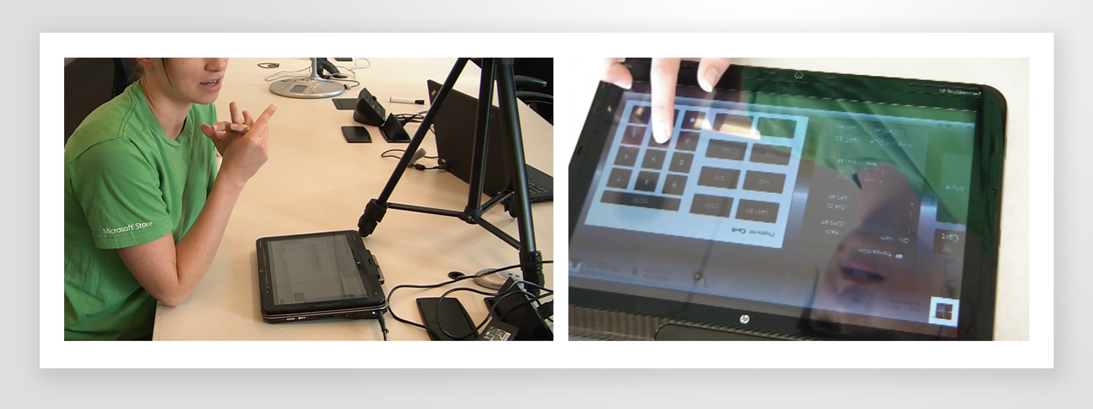
User studies and prototyping
Using the wireframes, I created a click-through prototype with 2 main scenarios to test with some users. A flow of purchasing 3 items using 3 different payment methods, and a return scenario. Goals were to see if the design direction was going in the right path, refine the flows from the scenarios we tested, and capture further feedback from the users. We had a total of 8 users and we ran the prototype in a similar device to the one they’re used to. Throughout the sessions, users provided good feedback, confirmed some of our assumptions, and gave suggestions on flows or features they thought would help them perform more efficiently.
They loved the more streamlined navigation, and the upgrades to the customer section. Previously, you were not able to see a customer’s purchase or appointments history from their profile, and I made sure to include that for this design. We were also able to discover more right terminology used in the sales floor, this would allow the action buttons and labels used in the tool to resonate faster and be understood by the POS users (for example, in a purchase flow, to use Void, instead of Cancel).
They also helped identify some gaps. We had previously thought that the product search was going to be a main feature, however, 90% of the users mentioned that in a purchase flow, they don’t search, they just scan items in fear of entering a different item with a wrong SKU. It also helped identify some sections or components that were never used nor made sense to keep inside the POS functionality. One example, the old POS had a set of buttons with pre-populated cash amounts in the checkout screen; multiple associates mentioned that they never used those. It was easier for them to type in the amount, thus eliminating the buttons would also reduce risks of entering wrong data.
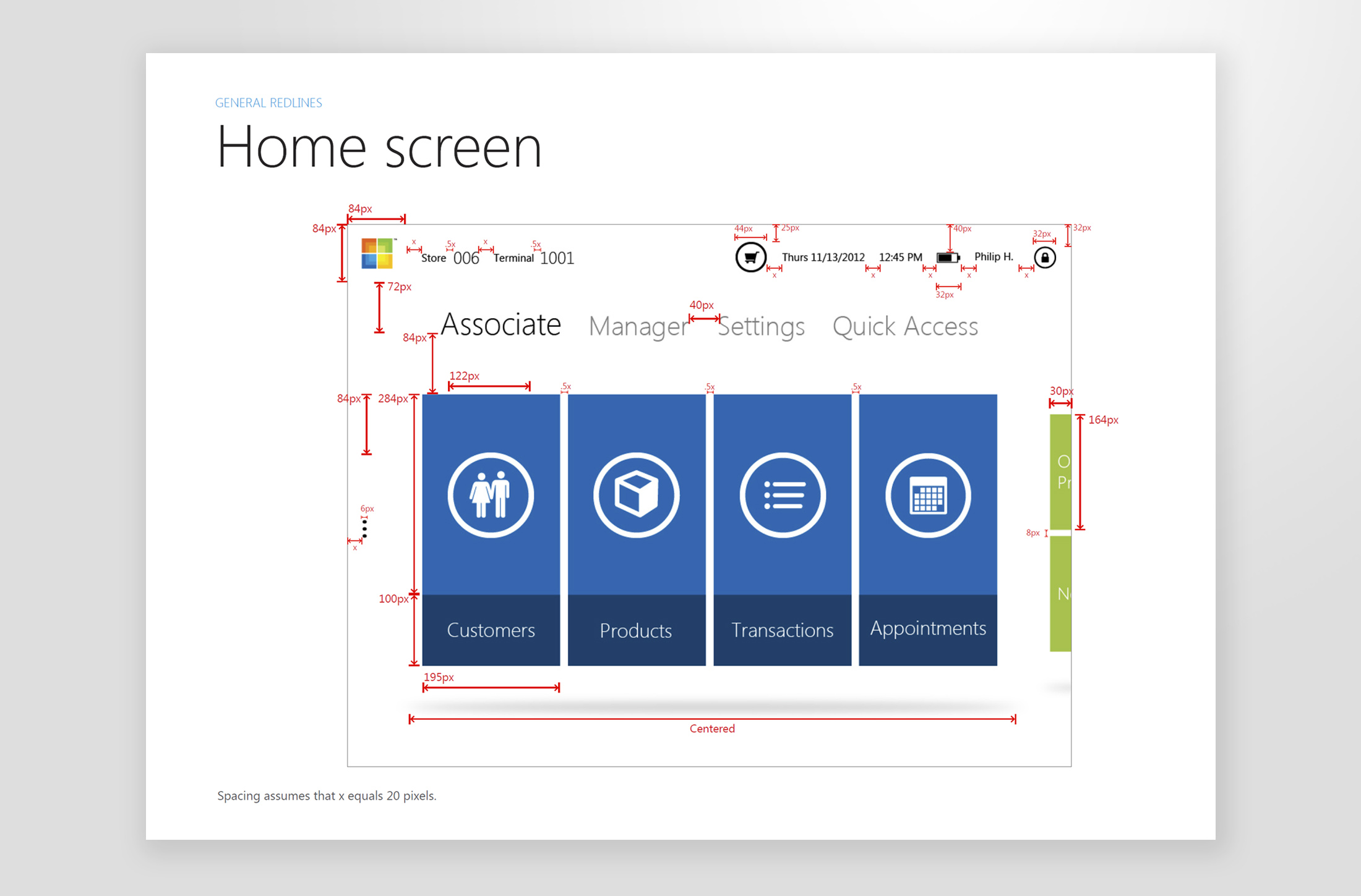
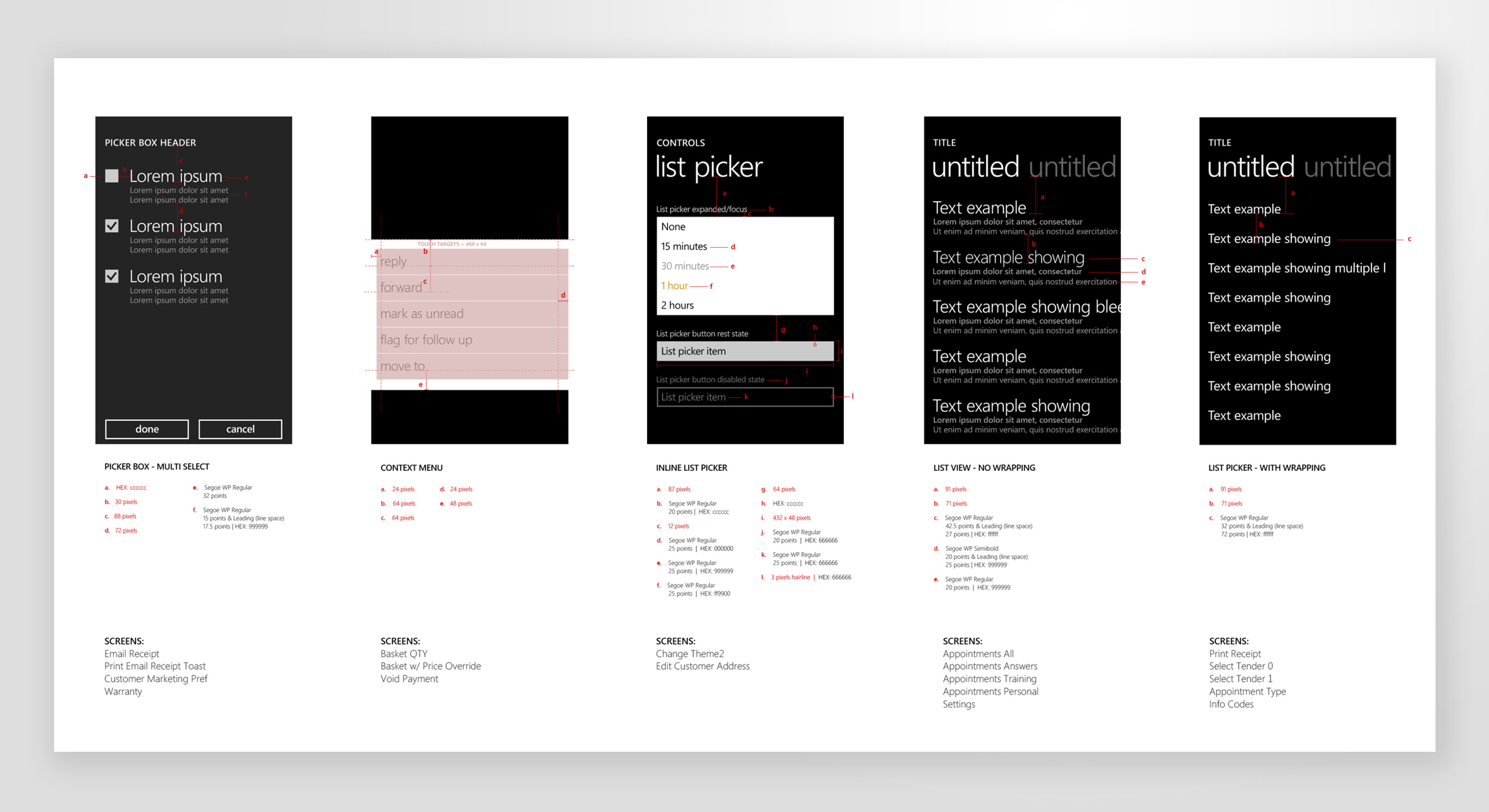
Visual design
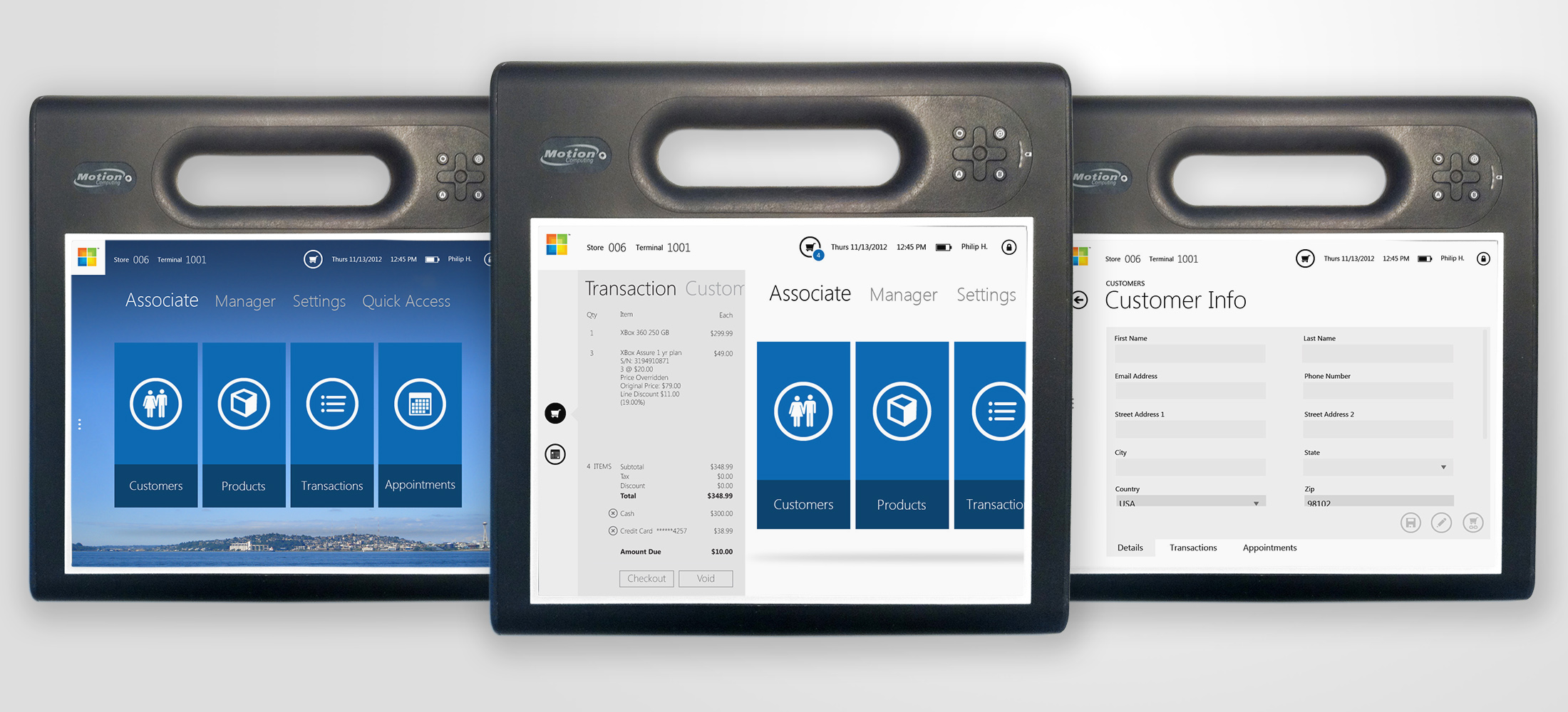
After analyzing the results from the user studies, I got to make a lot of refinements to the IA document and in parallel started working on the visual style. For the UI, I grabbed inspiration from the fairly new Metro design (later called Modern) and ideas from what the Xbox, Windows, and Zune teams were doing.
These are some sample screens. The one on the left shows an exploration with a different theme, where the background would change depending on the location of the store (hello Space Needle for the Seattle store!). It’s always great to look back at your designs time later and see what changes you would make (like the text fields not being grey).
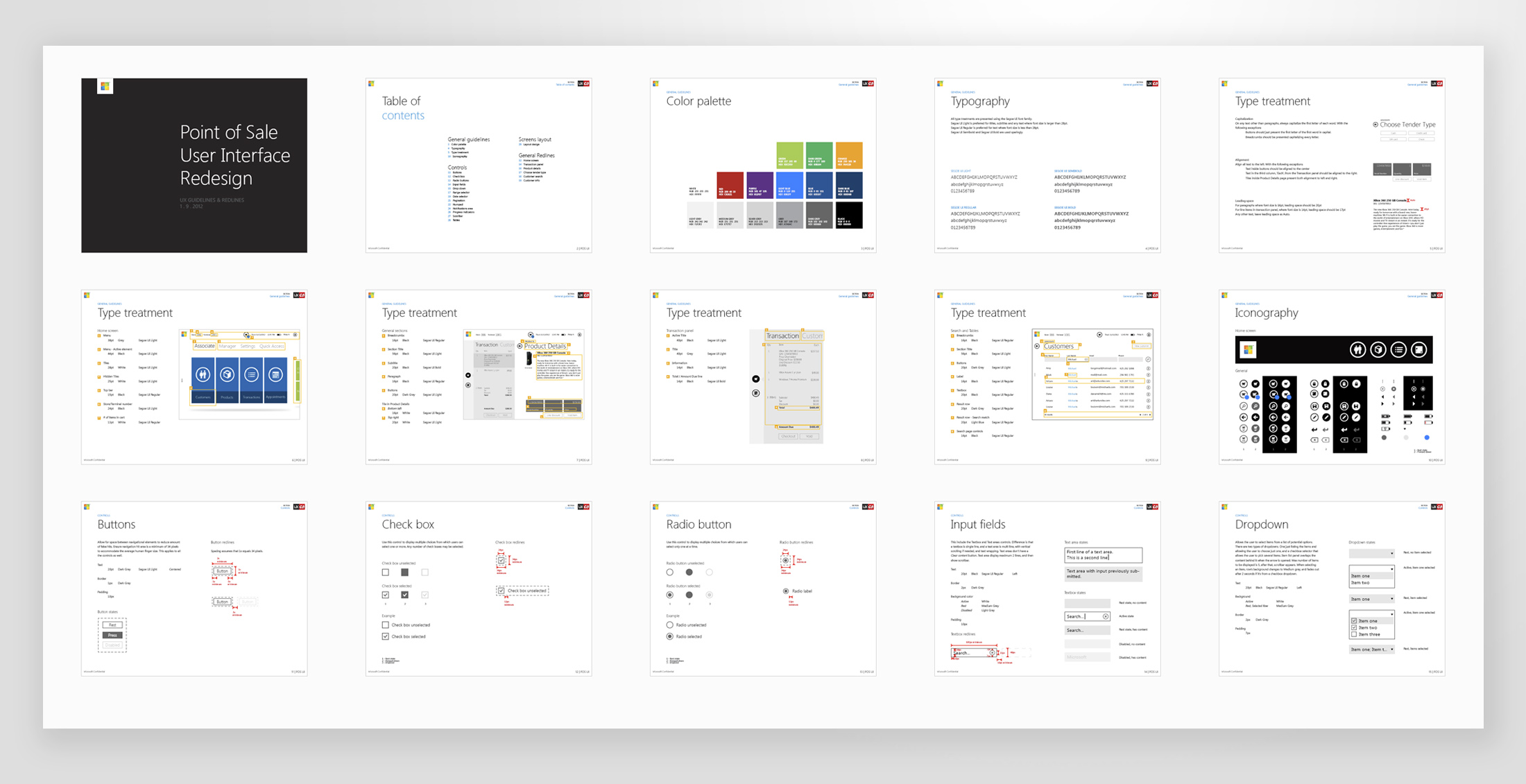
Here are some samples of the style guide and redlines document that I created for this version of the POS.
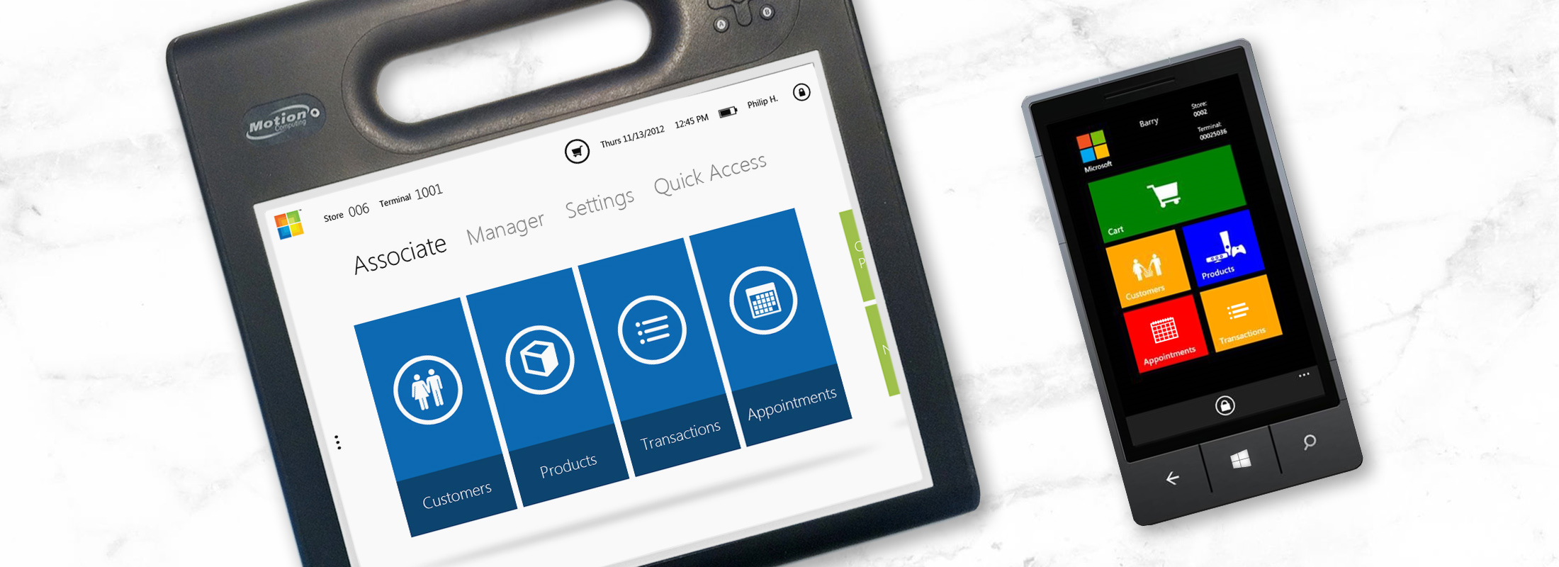
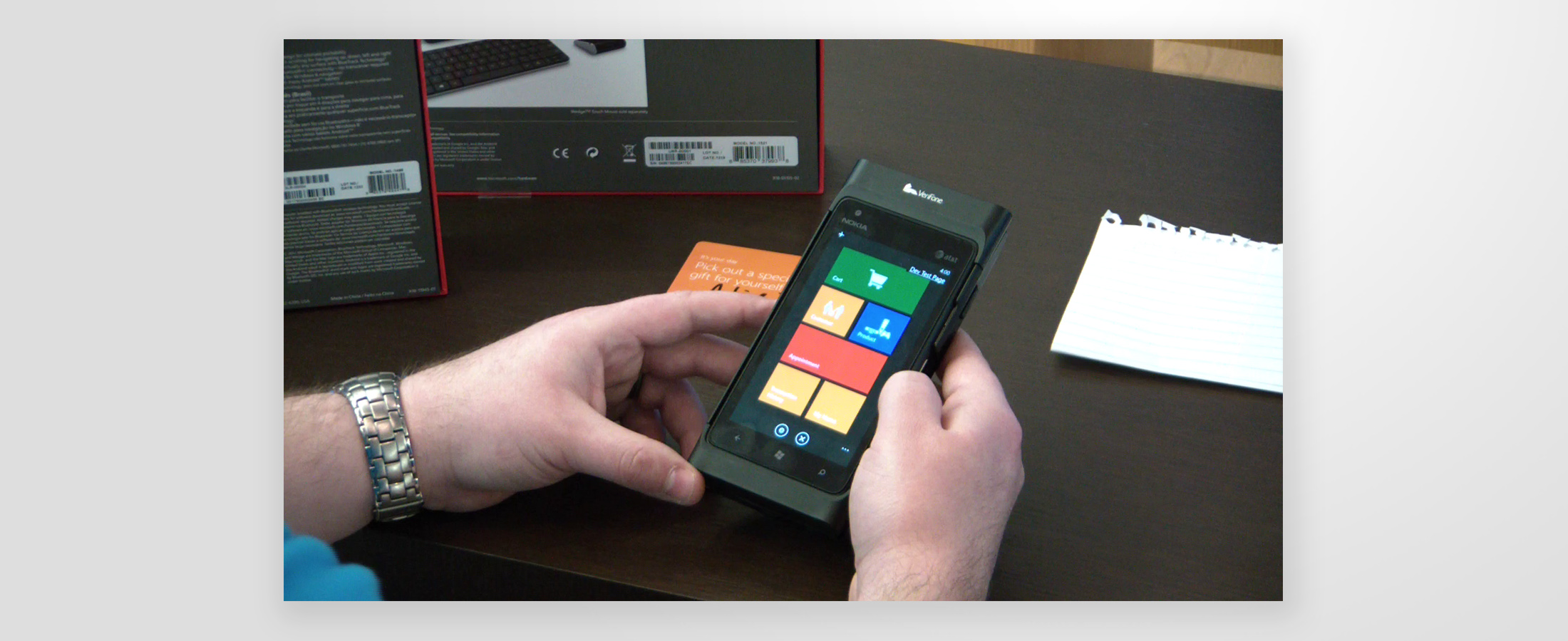
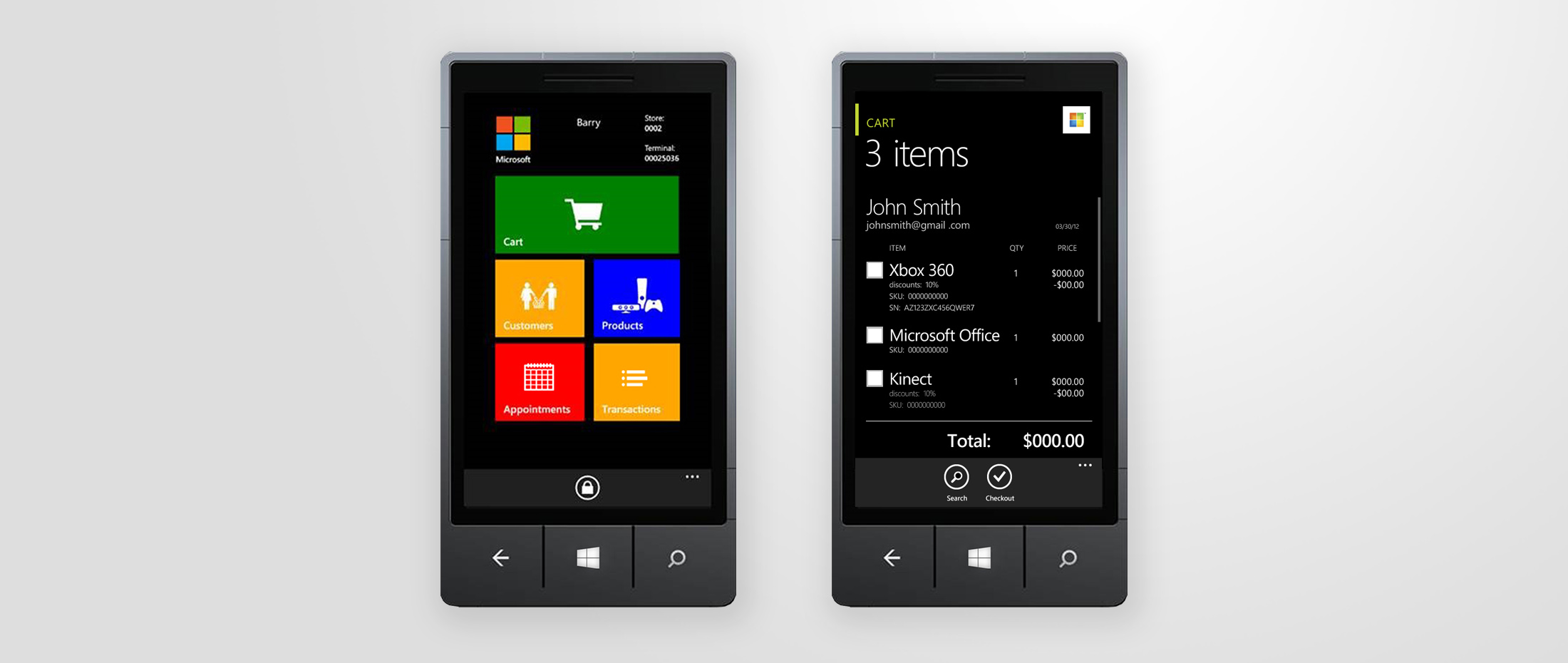
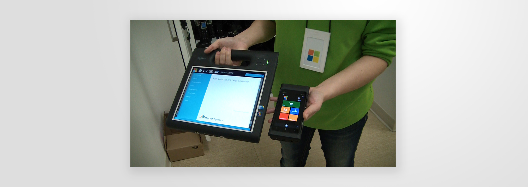
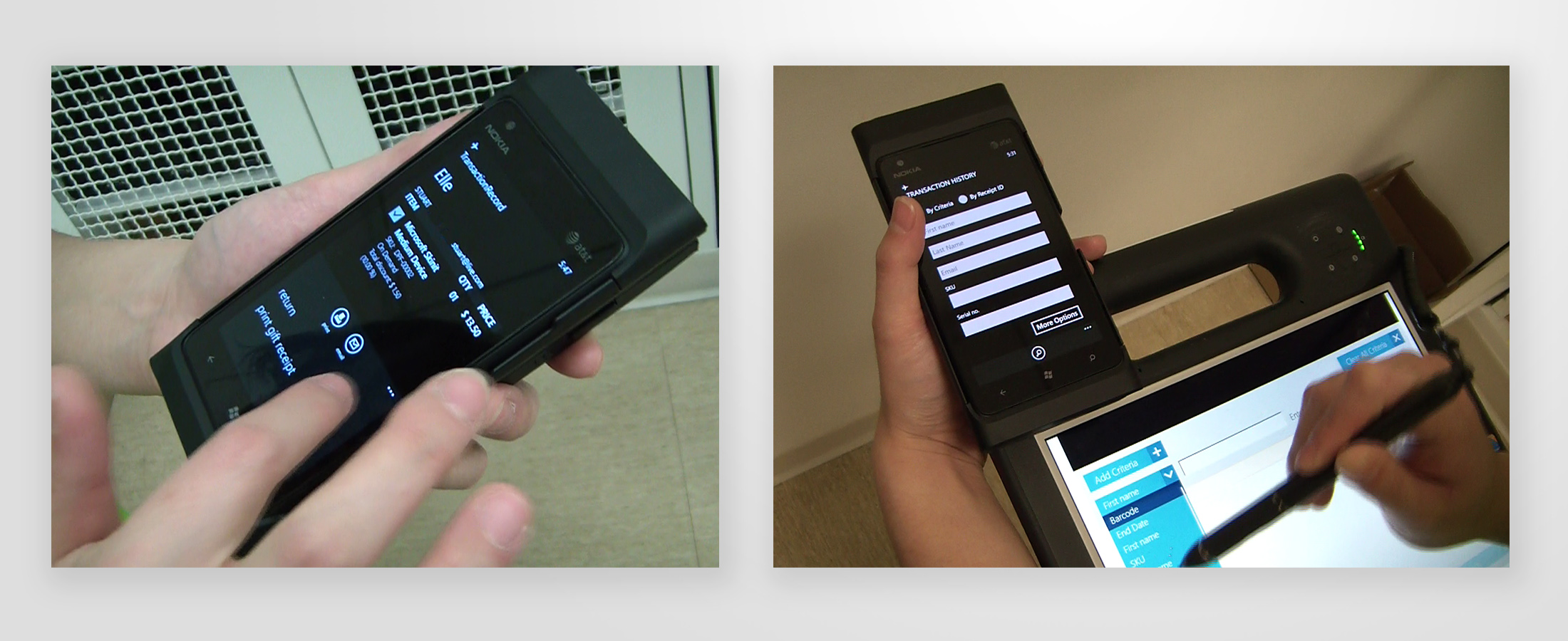
Mobile phone POS
I worked on the slate version for 6 months and at the end of that period, I switched teams and came back to the retail stores around 7 months later. During that time, the leadership team decided to switch devices, from the slate into a mobile phone. 2 designers worked on adapting the IA and functionality that I had gathered into the new mobile experience, and when I joined the project it had already started the development phase. My main role during the mobile phase was to participate in code reviews, do usability testing, and make design updates based on those. The new POS increased the user satisfaction to 92%, a 44% increase from the slate version.
Development process
The process of development the mobile POS was interesting since it involved a lot of evangelization of the value that good UI brings to a project. The design files were created using Microsoft Blend, and I had access to the developers test environment. I was in charge of logging design related bugs and trying to align the team to follow our redlines and style guidance.
We had frequent code reviews where we established the priority of the work items and reviewed major features. At first, it was though convincing the team on why some bugs needed to be addressed, but eventually the process went more smooth, specially once we had users test some prototypes.
User testing
After some months of development, we had a usability study with a prototype. Goal was to discover usability issues and validate completion of flows.
- Store associate
- Store associate
We had 5 associates and overall the results were pretty positive with actionable feedback. We were able to identify some ambiguous flows (some were addressed by changing the copy on labels or CTAs, others required larger UI changes), desired improvements (adding notes when creating/editing appointments), reduce some confirmation dialogs, UI fixes (spacing of elements, size of touch targets, etc), and more.
Pilot launch of the new POS
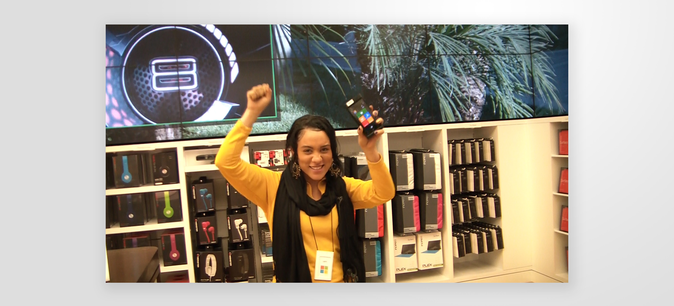
After the feedback from users, I made some revised UI changes and fought to get most of the updates implemented. Finally, a few weeks later, we had a solid enough experience, and we launched a pilot in some stores. That day, I interviewed a total of 15 associates and managers to capture their reactions to the new system after they’ve been using it in the real world for a couple of hours.
- Store associate
- Store associate
Learnings
There’s no better feeling as a designer than when you hear your users saying how happy they are with something you worked on, knowing that their job will be more enjoyable and their flows will be more efficient.
The project road was long and there were several intricate flows with some degree of variation, depending on specific location of the stores, for example in regards of taxes or for promotions/discounts; even for accessibility constrains for specific states (looking at you California!). Plus some hurdles trying to prioritize UX bugs higher in the task pools. We were lucky to be able to interact directly with a pool of our final users. It served greatly in the initial stages to understand their world and objectives, throughout the process to validate assumptions, and at the end of the development process to verify that we built something useful for them.